


'Logo'
The other day I found a beat up old Lite Brite at the thrift shop for two bucks. It was one of those old school ones with a wide aspect ratio and not the square sided Lite Brite cube they sell nowadays. It reminded me that I had a pack of Lite Brite Transformer patterns from 1985 buried in the garage somewhere. So I bought it and I grabbed my patterns and then I sat down and remembered why I was never into Lite Brite when I was a kid in '85. Back then it seemed like too much work for little payoff. All the pegs and patterns were

 |
 |
|---|---|
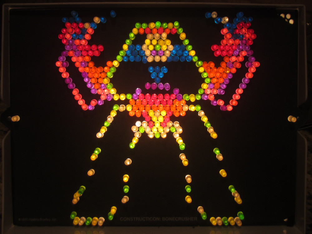
| Snarl in Action | Constructicon: Bonecrusher |
What I can appreciate now that I did not see back when I was a kid is that Lite Brite is a medium with constraints, and working within the limitations takes and inspires imagination. I used to be critical of the '85 Transformer Lite Brite patterns because they were so colorful and didn't stick to my preconceived notions of what a certain character's color pallet should be. I wanted the Lite Brite patterns to look like cels from the cartoon and they fell way short of that. Then as I began working on these with my kid, I realized what the Lite Brite artists were up against. They had to deal with a screen resolution of approximately 45x39, they only had eight colors (nine if you considered the black sheet), and there were only about 45-50 pegs of each color to work with. Understanding the constraints made me really appreciate some of the patterns for the masterworks of color and design they were. I ended up falling in love with some of them exactly because they were so colorful and didn't stick to my preconceived notions of what a certain character's color pallet should be!
 |
 |
|---|---|
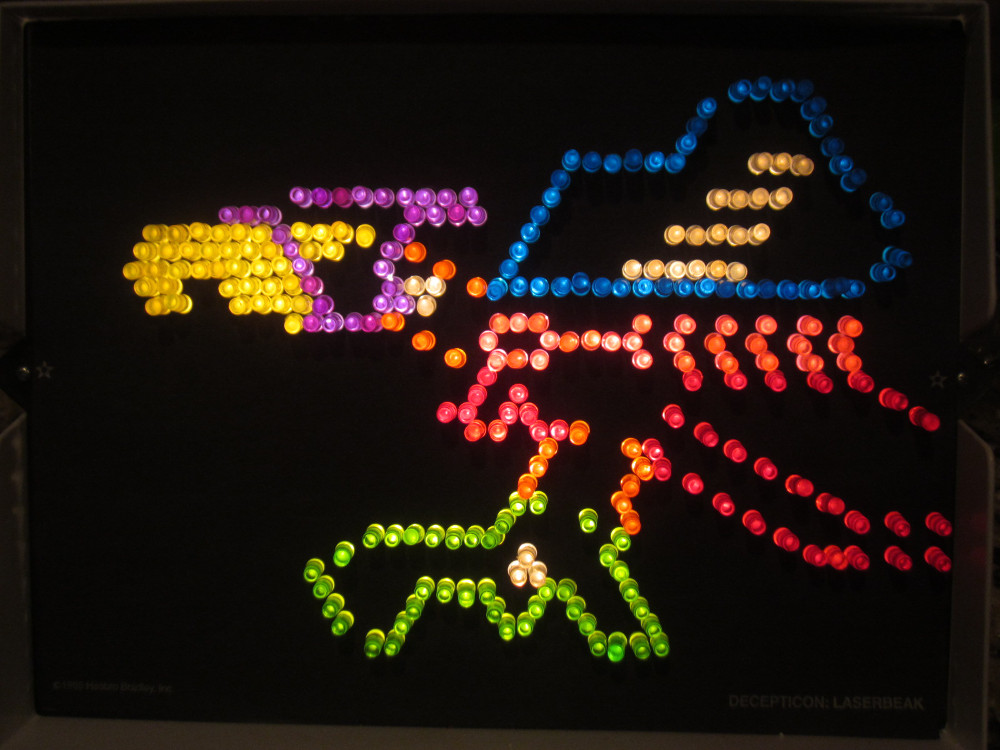
| Decepticon: Laserbeak | Decepticon Leader: Megatron |
I am still critical of the character choices made. I think they could have done a nice Optimus Prime or Bumblebee instead of second stringers like Bonecrusher or Laserbeak but they did pretty good with what they had. Who knows if Hasbro had certain robots they wanted featured over others. And maybe it was too tough to break away from a color scheme as iconic as Optimus Prime's read and blue because there weren't enough pegs of the right colors. It's also tough to capture all the necessary details of a certain character and not have it look like a jumbled mess. For the most part the color choices they did make break up the different sections of each robot so you can tell what you're looking at. The "Decepticon Leader: Megatron" pattern is really good example of that. I also liked the scenes that did a good job of conveying a sense of dynamic action like 'Constructicon: Bonecrusher' and 'Snarl in Action'. Others like Decepticon: Laserbeak' kind of fell flat for me. There was one that really blew me away, though, and that was the appropriately titled 'Bombshell Blasts Away'.

Bombshell Blasts Away
I don't remember seeing Bombshell ever use his twin ion impulse blaster in the cartoon or anywhere but boy is he blasting away here. His blaster and the explosion at the end of it is a wonderful mix of the brighter colors (including the violet I would have used for his chest) while the darker red and blue are used to outline his body. Although these colors aren't what I would have used I think they work nicely. I guess the violet is a bit too bright to represent Insecticon purple so they worked around that. Regardless, this is one of my favorite patterns. You could say I found it hypnotizing hypnotizing.
But we are only halfway through! In part two I will cover the other patterns in the set, including some beautiful Dinobot pieces that transcend the medium and are just great art, and two other patterns that really really suck. Be here next time for Brite My Litest Hour II: Electric Boogatrons!


No comments:
Post a Comment