


 I was working on over a hundred new* ads for the Vintage Space Toaster Palace, writing the magical internet codes when I noticed that none of the countless 22 webpages that comprise it had closing HTML tags. This is like writing the bible and forgetting the periods at the end of every sentence. (Well maybe not the bible, more like Starrior fart jokes on toilet paper.) Thankfully web browsers understand robotarded morons like myself are writing HTML and they let people visit my page anyways, so aside from the horrific page design nobody knew how truly defective my code was. At least my shame was somewhat hidden. Nobody would ever know about the missing /html tags unless they looked at the source code but I still found it embarrassing. Which is funny because what should be embarrassing is that I'm 35 and my greatest accomplishment in life is a website about ads of 25 year old toy robots and spaceships. I took consolation in knowing that I may be an uneducated brown trash HTML moron but at least I'm not one of those semi-illiterates who pluralizes everything with an apostrophe.
If Megatrons were outlawed, only outlaws would have Megatrons
EVERYTHING I KNOW ISN'T WRONG, JUST DEPRECATED BY THE WORLD WIDE WEB CONSORTIUM
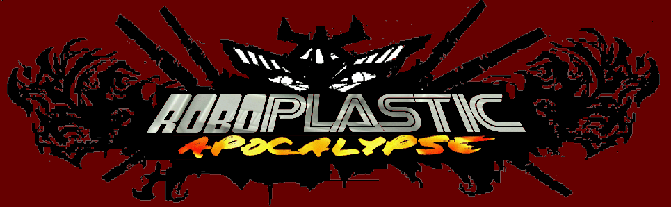
I decided that before I continue with putting up more ads I needed to address some other critical infrastructure issues at the Vintage Space Toaster Palace, the most important of which was the lack of pretty banners. Nothing says "this webpage guy knows HTLM" to me like lots of pretty, elongated rectangle-shaped pictures at the top of each page. (Except for maybe when websites do that thing where they center their content in the middle of the page. I find the CENTER tag the highmark of professional looking web design.) So I set out to realize the impossible dream of pretty banners and centered content at the VSTP. My basic banner idea was simple-take one ad from the GoBots and Micronauts and Transformers and everybody else and blow it up and put it at the top of their pages. I figured the whole project would take maybe a couple of hours on the weekend, tops. Then I ran into two problems: a) nobody uses the CENTER tag anymore because it's deprecated and b) I still can't figure out how to draw a straight line in Photoshop. So I was trying to figure out what to do and it ended up taking all my free time over 15 days.

MAKE HIS FONT ON THE HILL IN THE EARLY DAY
 In a further stroke of genius I thought, "Wouldn't it be cool if I put a 'Vintage Space Toaster Palace' logo on each banner in the same font as the toyline the banner is for?'" It seemed easy at first. All I had to do was rip off the fonts I knew internet people out there had already created. But then I ran into a problem because while fonts for Battlestar Galactica, Micronauts, Robotech and Transformers existed, for some strange reason nobody has dedicated their lives to making fonts for GoBots, the Star Bird, Wheeled Warriors and various unlicensed Robotron watches. Most surprising of all was the total absence of Voltron font. I guess it's understandable considering those less popular lines have only a cult following at best, but come on-VOLTRON? Why hasn't somebody made Voltron font? I see that Voltron logo and it's more rock and roll than the album covers of most every heavy metal band from the 80s. If your mom sees the Voltron logo in 1985 the first thing she thinks is 'WHO IS PILOTING THESE ROBOT LIONS? METALLICA?'
I'LL TAKE ROBOTS WITH GRIPPER ARMS AND SUCTION BASES IN THE DOLLAR BIN, ALEX
I really like how a couple of my banners came out, most notably those I did for GoDaiKin and Robo Force. Now there's no way in a million years I would have expected someone out there to do a Robo Force font, but I found the font from the TV show Jeopardy! to be pretty good match so I used that. I started exploiting a lot of similarities between fonts from different shows and toylines to make my banners. I noticed the font for Diakron just looked like the Battlestar Galactica font in italics and the Micronauts font was essentially Battlestar Galactica font wearing bell bottom pants.
IS THIS A COLLECTION OF OLD TOY ROBOTS ADS OR A VIRAL MARKETING SITE FOR A WHEELED WARRIORS vs STARRIORS MOVIE?
Learning about banners and fonting was a lot of fun. I feel like I'm in a special club of internet coding people who know what they're doing, even if what I'm doing is really only clear to myself and the resulting website is still rather confusing to the rest of the world. Hopefully the VSTP (whatever it is) now looks more attractive thanks to these banners and my inclusion of fancy new code like closing HTML tags. I hope the Googlebots that comprise the bulk of my traffic are impressed by all my newly amassed code mastery. Maybe one day I will move to that next level of Einsteinian internet code master wizardry-putting little boxes in bigger boxes. But I'll have to take it all a little at a time and there's no rush, really. Judging from my site statistics the VSTP lacks one other important thing that really well coded websites have-VISITOR'S.
*25 year old


1 comment:
Not that the others aren't neat-o, but I think the Voltron-themed banner turned out pretty sweet.
Post a Comment